Marketing Flyer & Brochure Series
A case study and gallery exploring the redesign of a marketing flyer system, focused on improving brand recognition, message hierarchy, and visual consistency.
Design Challenges of the Legacy Flyer Layout
Before redesigning the flyer system, I evaluated the existing layouts to understand what was limiting clarity, brand recognition, and message hierarchy.
-
Weak brand visibility.
Logo placement at the bottom and low contrast against the background reduced immediate brand recognition. -
Unclear message hierarchy.
Messaging lacked structural separation, making content difficult to scan and prioritize. -
Limited visual differentiation.
Consistent use of a single color reinforced branding but provided little distinction between individual flyers.
Swiss Grid–Inspired Wireframe System
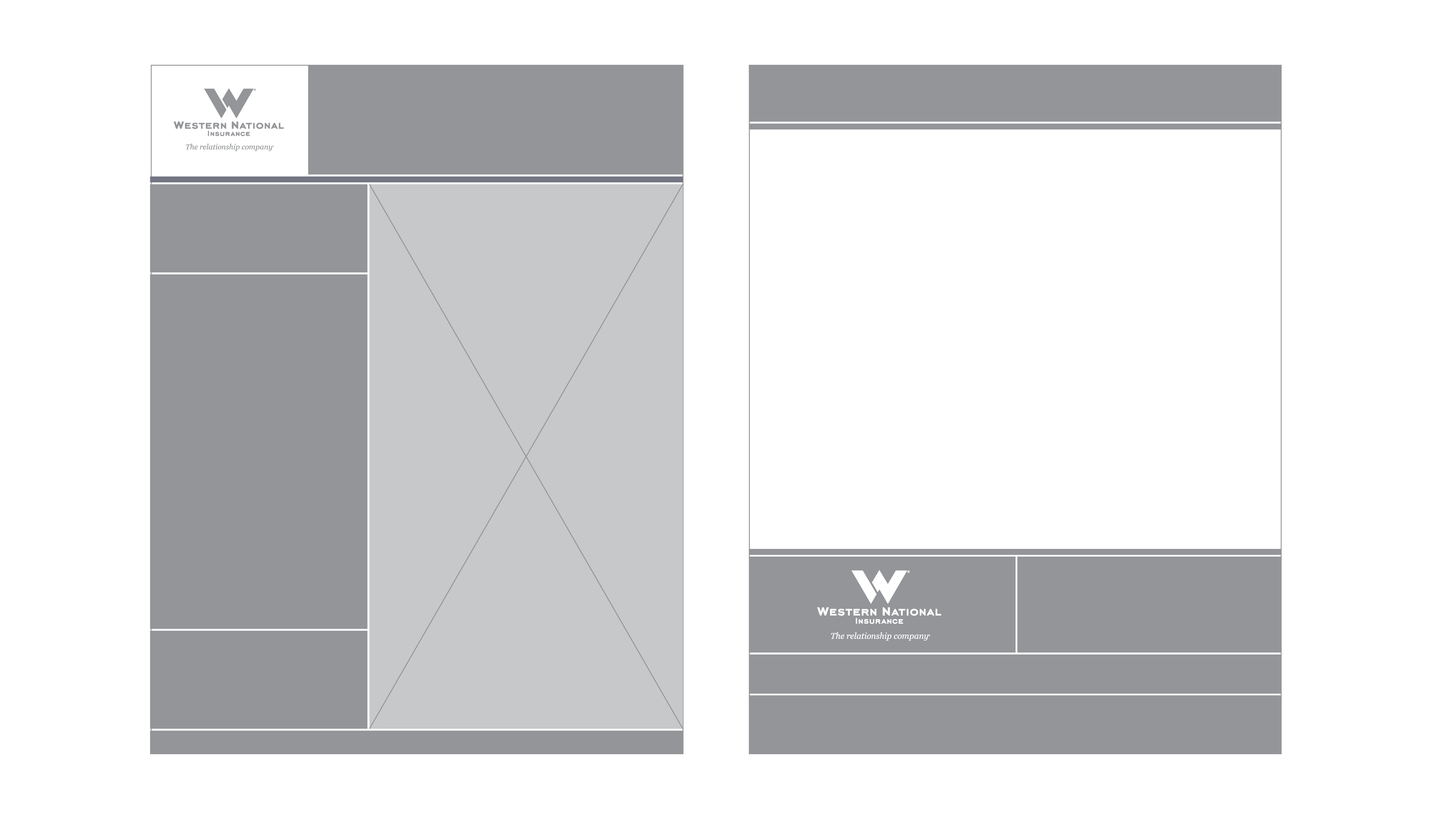
To resolve the issues in the legacy layouts, I introduced a Swiss grid–inspired wireframe system to bring structure, clarity, and consistency to the flyer series.
-
Clear visual hierarchy.
A structured grid establishes predictable reading order, allowing viewers to quickly identify headlines, supporting copy, and calls to action. -
Intentional content separation.
Rather than grouping all messaging into a single block, content was divided into defined regions to improve scannability and comprehension. -
Consistency with flexibility.
The grid maintains consistency across flyers while allowing variation, enabling new layouts to be produced quickly within a defined structure.
Applying the Grid to the Final Layout
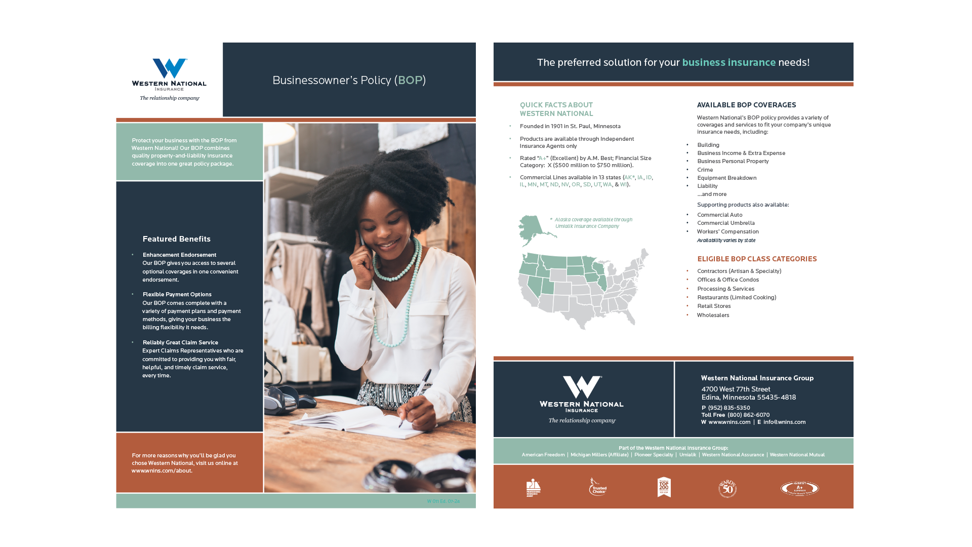
The wireframe system was translated into a refined layout focused on clarity and structure.
-
Stronger brand presence.
The logo and headline were repositioned within the primary grid columns, establishing immediate brand recognition and visual authority. -
Defined content blocks.
Messaging was separated into intentional sections, improving readability and allowing viewers to process information in clear, structured steps. -
Visual balance and rhythm.
Alignment, spacing, and proportion were refined to create a balanced composition that feels cohesive while allowing emphasis where needed.
Flyers & Brochures Design Gallery
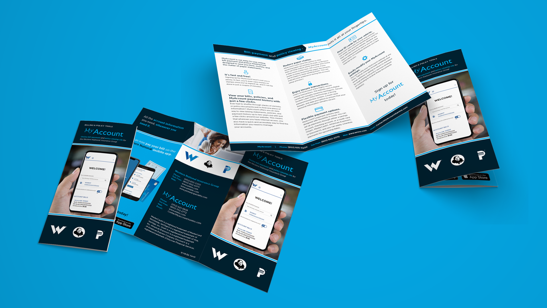
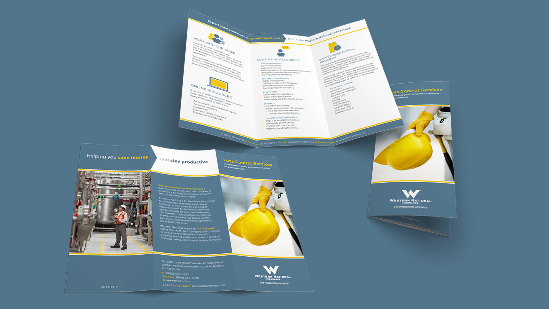
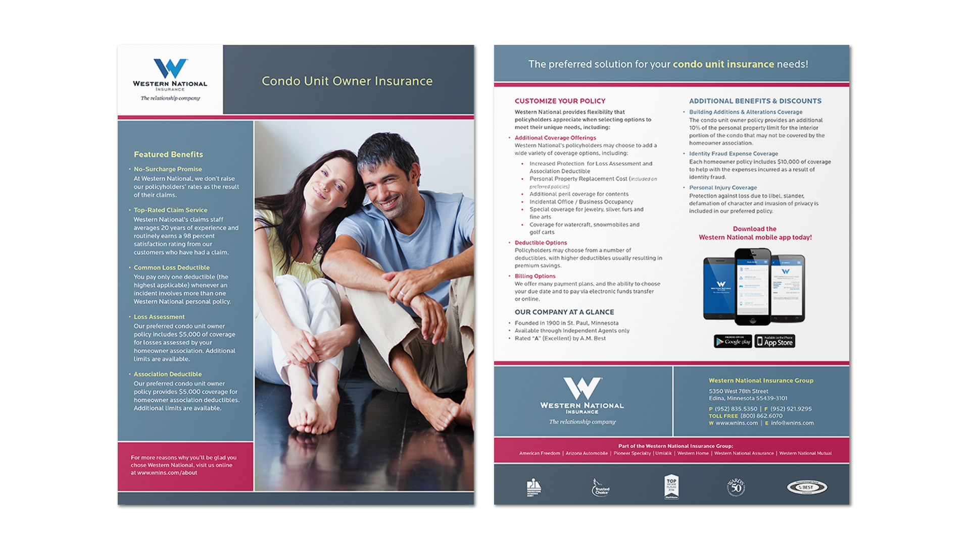
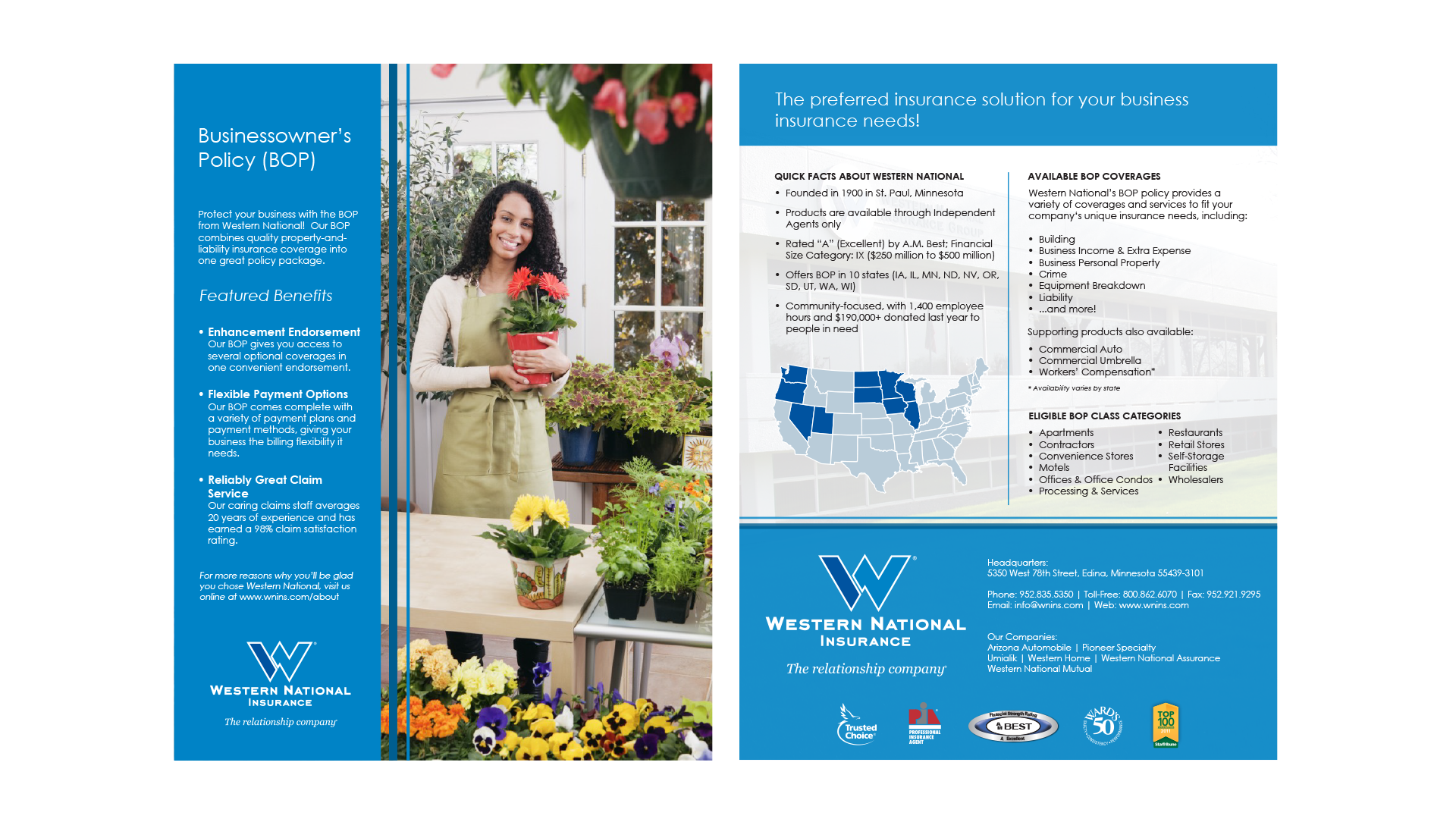
The grid provides a consistent framework across flyers while allowing variation in imagery, messaging emphasis, and campaign focus—applied across formats from letter-size flyers to trifold brochures.